7 Ways to Mix Wood Tones, Compared: Rules, Ratios, Tools, and Shortcuts
By Ingrid Halvorsen, Home Planning Specialist · September 20, 2026
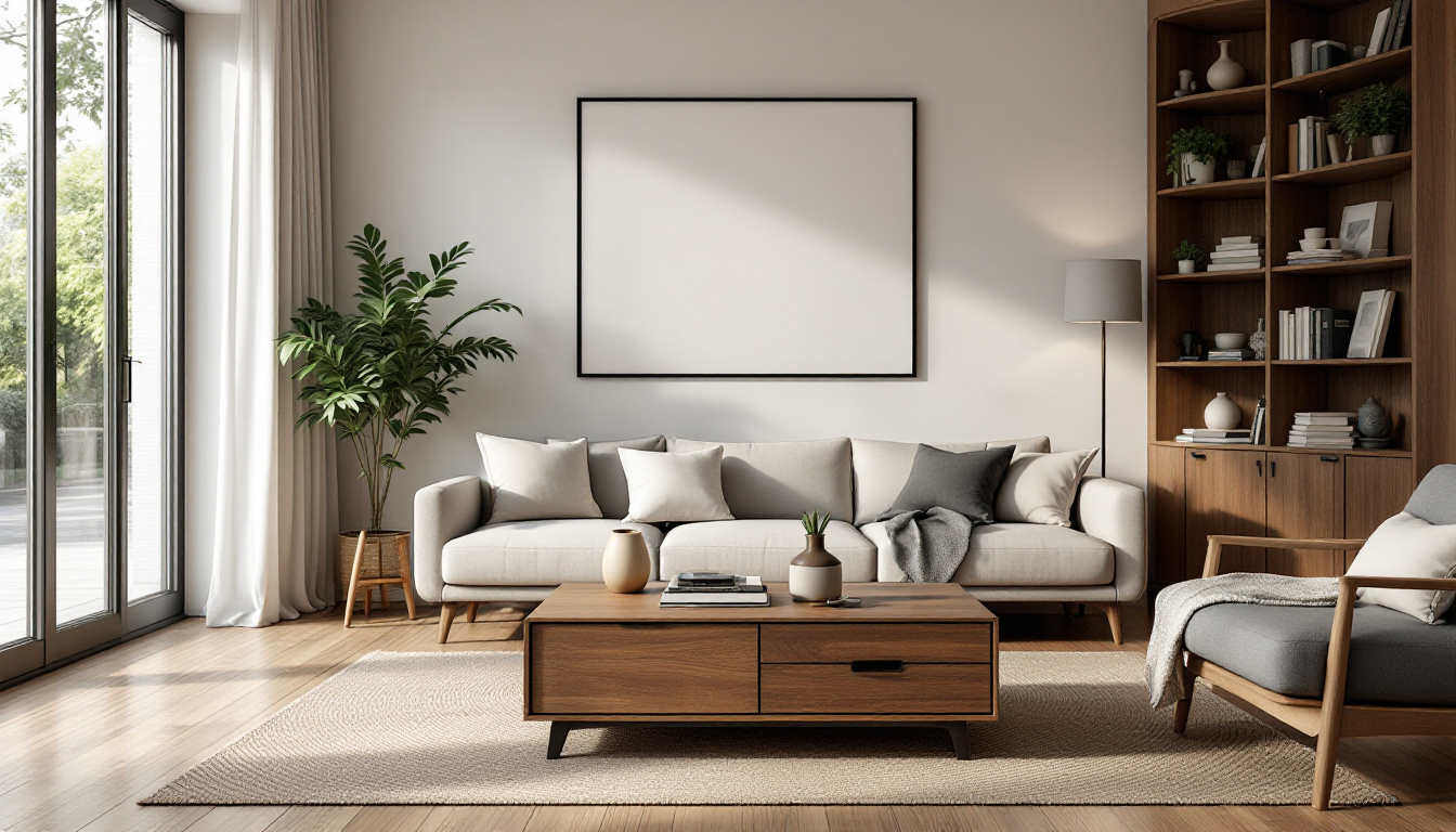
Every room with more than one wood surface eventually asks the same question: does this floor fight with that dresser? Homeowners usually reach for advice one piece at a time — a rug here, a stain match there — without ever comparing methods side by side. This guide takes the opposite approach. Below are seven distinct ways to approach mixing wood tones, evaluated on speed, cost, and how forgiving each one is for someone who has never done it before. If you want the foundational concepts first, our beginner's guide to mixing wood tones covers the "why" behind these methods in more depth.
1. The Undertone-Matching Rule
This is the classic designer shortcut: sort every wood by whether it leans warm (red, orange, yellow) or cool (gray, ash, taupe), then only mix within the same family, or use one dominant undertone and treat the other as an accent.
- Pros: Free, fast, works in any budget, and prevents the most common clash — warm oak next to gray-washed floors.
- Cons: Requires a decent eye for color; some woods have mixed or ambiguous undertones (walnut can read warm or neutral depending on light).
- Best for: Anyone starting from scratch before buying furniture.
2. The 60-30-10 Distribution
Borrowed from color theory, this method treats wood tones like paint: pick a dominant tone for 60% of visible wood (usually floors), a secondary tone for 30% (major furniture like a bed frame or dining table), and an accent tone for the remaining 10% (a shelf, picture frames, a side table). This is the same ratio used in the well-known 60-30-10 rule for interior color balance, applied specifically to timber.
- Pros: Gives a concrete, measurable target instead of vague "balance."
- Cons: Estimating percentages by eye takes practice; open-plan rooms make ratios harder to judge.
- Best for: People who like formulas more than instinct.
3. Physical Sample Boards
Collect actual swatches — flooring offcuts, stain chips, veneer samples — and lay them side by side in the room's real lighting before buying anything.
- Pros: Most accurate method for judging undertones, since screens and store lighting distort color constantly.
- Cons: Slower, and getting samples of large furniture pieces isn't always possible.
- Best for: High-stakes purchases like flooring or a dining set you'll keep for a decade.
4. The Contrast-First Method
Instead of matching tones, this approach deliberately pairs a very light wood (whitewashed oak, ash) with a very dark one (espresso walnut, ebony) and skips the muddy middle ground entirely.
- Pros: High contrast is easier to get right than close-but-not-quite matches, which often look like mistakes rather than choices.
- Cons: Less forgiving in small rooms, where strong contrast can feel busy or chopped-up.
- Best for: Modern or transitional interiors with clean lines and larger square footage.
5. Anchoring with a Neutral Buffer
Introduce a neutral material — a black metal frame, a woven jute rug, painted white trim, or matte stone — between two wood tones that don't naturally sit well together. The neutral acts as a visual pause.
- Pros: Rescues combinations that would otherwise clash; very budget-friendly since a rug or paint color is cheaper than replacing furniture.
- Cons: Doesn't work if the room already has heavy wood coverage on floors, ceiling beams, and trim simultaneously.
- Best for: Renters or anyone mixing inherited furniture with newer pieces.
6. Species-Based Pairing
Rather than judging color alone, this method matches wood by species characteristics — grain pattern, density, and natural finish — since two woods with similar grain often read as coordinated even with slightly different tones. Understanding species is also useful beyond decorating; our comparison of furniture-grade wood species breaks down grain and workability differences in detail.
- Pros: Produces a more "collected over time" look rather than a showroom-matched set.
- Cons: Requires knowing your species, not just your stain color, which takes some homework.
- Best for: Vintage, antique, or eclectic interiors.
7. Planning It Digitally Before You Buy
The most modern option: use room-planning or 3D visualization software to place different wood tones on virtual floors, cabinets, and furniture before spending a cent. This avoids the classic mistake of buying a rug or table that only reveals its clash once it's sitting in the actual room. Tools like home3dplan.com let you test flooring and furniture finishes together in a realistic 3D layout, which is especially useful when you're also finalizing a room's lighting plan, since warm or cool bulbs change how wood tones read.
- Pros: Lets you compare multiple combinations quickly and cheaply; great for full remodels or new builds where nothing exists yet.
- Cons: Requires basic software comfort; rendered color isn't 100% identical to real materials under real light.
- Best for: Remodels, new construction, or anyone furnishing an entire room at once rather than piece by piece.
How to Choose Between These Methods
- Just moved in and improvising: Start with the undertone rule and a neutral buffer.
- Doing a full renovation: Combine sample boards with digital planning before ordering flooring.
- Furnishing room by room over time: Species-based pairing keeps things cohesive without requiring an exact color match.
- Want a bold, modern statement: Contrast-first is the fastest route to an intentional look.
The Takeaway
None of these methods are mutually exclusive — most well-designed rooms actually use two or three at once, such as an undertone-matched floor, a contrast-first accent piece, and a rug acting as a neutral buffer between them. The right combination depends on your budget, your timeline, and whether you're decorating around existing furniture or planning from a blank floor plan. Testing ideas digitally before committing, whether through swatches or software, remains the cheapest insurance against a costly mismatch.