The 60-30-10 Rule in Interior Design: A Beginner's Guide to Balanced Color
By Conor Sheridan, 3D Visualization Lead · September 7, 2026
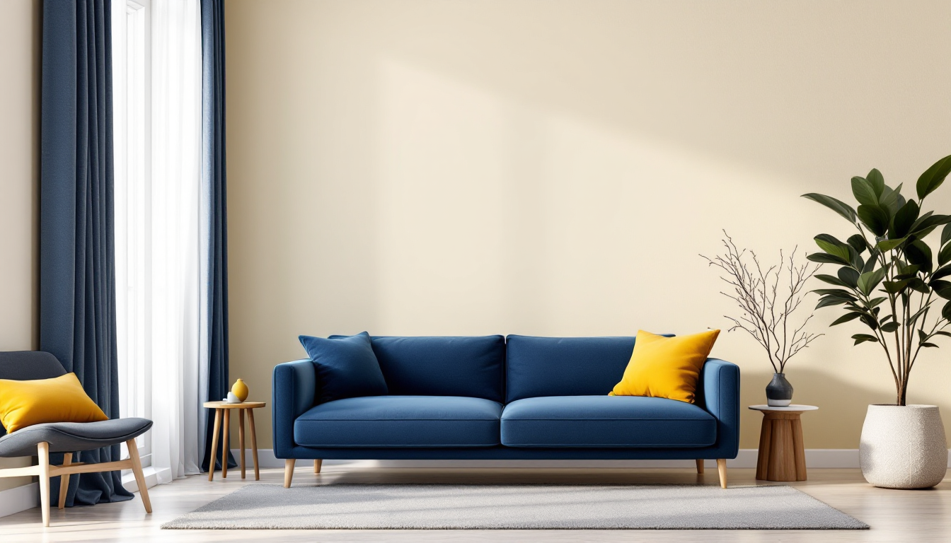
What Is the 60-30-10 Rule in Interior Design?
If you've ever walked into a room and felt like the colors just "worked" without being able to explain why, there's a good chance the designer used the 60-30-10 rule. It's one of the simplest color formulas in interior design, and it's a great starting point if you're new to decorating and unsure how to combine colors without the result looking chaotic or flat.
The rule breaks a room's color palette into three proportions:
- 60% dominant color — usually walls, large furniture, or flooring
- 30% secondary color — upholstery, curtains, rugs, or an accent wall
- 10% accent color — pillows, art, vases, and other small details
- Treating the ratio too rigidly. 60-30-10 is a guideline, not a measuring tape. Aim for the general balance, not an exact percentage.
- Skipping the accent color. Rooms without any 10% pop often feel safe but lifeless.
- Choosing colors in isolation. A paint chip under store lighting can look completely different once it covers an entire wall next to your furniture and floor color.
- Forgetting texture and material. Two similar colors in different finishes (matte fabric vs. glossy wood) still read as distinct, so don't be afraid to repeat a hue across different materials.
This isn't an arbitrary design trend — it borrows from classical art and fashion theory, where balanced ratios create visual harmony without monotony. Applied to a home, it gives you a repeatable system instead of guesswork.
Why This Ratio Works So Well
The human eye tends to feel unsettled when colors compete for attention in equal amounts. Splitting a palette into a clear majority, a supporting middle layer, and a small punch of contrast mimics how we naturally read a scene: one thing anchors it, one thing supports it, and one thing draws the eye. This is why the 60-30-10 rule works whether you're decorating a minimalist studio or a maximalist living room — the proportions stay the same even if the colors and styles change dramatically.
It also solves a very common beginner problem: choosing too many "main" colors that fight each other. When you assign every color a role and a percentage, you naturally avoid overload.
How to Apply the 60-30-10 Rule Step by Step
1. Pick Your Dominant Color (60%)
Start with the color that will cover the largest surfaces — typically your walls, large rugs, or major upholstered pieces like a sofa. Neutral tones (white, greige, soft blue, sage) are popular here because they're easy to live with long-term, but the dominant color doesn't have to be neutral. It just needs to be something you're comfortable seeing in large quantities.
2. Choose Your Secondary Color (30%)
This color should complement the dominant tone without matching it exactly. It usually appears on curtains, an accent chair, bedding, or a feature wall. A useful trick: pick a secondary color that's one or two shades darker or a different family of the same tone family — for example, a warm terracotta paired with a cream dominant color.
3. Add Your Accent Color (10%)
This is where you can be bold. The accent color shows up in the smallest doses — throw pillows, artwork, a vase, lamp bases, or door hardware — so even a saturated or unusual color reads as intentional rather than overwhelming. This is the easiest place to update a room seasonally without repainting anything.
4. Test the Balance Before Committing
Before you buy paint or furniture, it helps to see the ratio in context rather than as isolated swatches. Many beginners find it useful to sketch or model the room digitally first, since seeing color proportions on real walls and furniture — rather than paint chips side by side — makes it far easier to catch imbalance early. Tools that let you preview a full room in a realistic 3D layout can save you from expensive trial-and-error repainting.
Common Beginner Mistakes
Where This Rule Fits Into a Bigger Design Plan
Color is only one layer of a room's overall design. Once your palette feels balanced, the next questions are usually about layout and scale — how furniture is arranged, how much negative space you leave, and how the room reads visually as a whole. If you're also rethinking furniture placement, it's worth looking at how arranging furniture in a small bedroom can affect how a color scheme reads in a compact space, since tight layouts change how much of each color is actually visible at eye level.
If you're planning a full room from scratch — new paint, new furniture, and a new layout — it also helps to visualize everything together before spending money. Beginners often start with a simple floor plan and build up from there; our guide on turning a 2D floor plan into a 3D model walks through exactly that process, which pairs naturally with testing a 60-30-10 palette before committing to real paint and fabric.
A Simple Way to Start Today
You don't need a professional color consultation to use this rule. Look at a room you already have in mind, choose one dominant neutral or muted tone, pick a secondary color you like paired with it, and pick one accent color that feels a little more daring than you'd normally choose. Apply them roughly in the 60-30-10 proportions using paint, textiles, and small decor items, and you'll likely notice the room feels more intentional almost immediately — even before you change a single piece of furniture.