7 Ways to Choose a Color Palette for a Room, Compared
By Camille Moreau, Lead Interior Designer · October 24, 2026
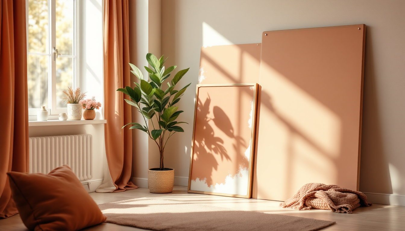
There's more than one way to land on the right colors
Ask five designers how to pick a color palette and you'll get five different starting points — a rug, a photo, a piece of art, a color wheel, a digital tool. None of them is wrong. The real question isn't "what's the correct method," it's "which method fits how you think, how much risk you can tolerate, and how much time you want to spend." This guide lines up seven common approaches side by side so you can pick the one that matches your room, your budget, and your patience for trial and error.
If you want the fundamentals first — undertones, the 60-30-10 rule, lighting basics — our beginner's guide to choosing a color palette covers that groundwork. This post assumes you know the basics and want to compare tactics for actually arriving at a palette.
1. Start from a fixed, unchangeable element
This is the classic professional method: pick colors to match something in the room you can't change — a stone fireplace, existing tile, a wood floor, or a built-in cabinet.
- Best for: renovated rooms with expensive finishes already in place
- Pros: grounds the palette in reality; avoids clashing with big-ticket items
- Cons: limits creative freedom if the fixed element is a color you don't love
2. Build around a statement piece
Choose a rug, artwork, or patterned sofa first, then pull three to five colors from it for walls, trim, and accents.
- Best for: people who already own (or plan to buy) one bold item they love
- Pros: fast, visual, hard to get "wrong" since the colors already coexist in the source piece
- Cons: locks you into a specific style direction early
3. Use a color wheel and a formula
Classic color theory — complementary, analogous, triadic, monochromatic — gives you a rule-based way to generate combinations without guessing.
- Best for: methodical planners who want a repeatable system
- Pros: technically balanced; easy to explain to a painter or contractor
- Cons: can feel academic; doesn't account for a room's actual light or furniture
4. Borrow a pre-made designer palette
Paint brands and design blogs publish curated palettes (often three to six colors) tested in real rooms. You just apply one as-is.
- Best for: beginners with low risk tolerance and limited time
- Pros: virtually foolproof; colors are pre-tested to work together
- Cons: less personal; popular palettes can feel generic in a neighborhood of similar homes
5. Take cues from nature or architecture
Pull tones from your view — bark, stone, sky, foliage — or from your home's architectural style, like warm clay for a Spanish-style house or crisp neutrals for a mid-century build.
- Best for: rooms with big windows, strong views, or a defined architectural identity
- Pros: creates a sense of place; palette feels inevitable rather than arbitrary
- Cons: requires a strong existing context (a plain apartment box won't offer much)
6. Test physical swatches at full scale
Paint large boards (at least 2x2 feet) and move them around the room across a full day, checking morning, midday, and evening light.
- Best for: anyone about to commit to a wall color they can't easily undo
- Pros: the most accurate real-world read on how a color actually behaves
- Cons: slow, a bit messy, and only tests paint — not fabric or furniture combinations
7. Visualize digitally before buying anything
Upload a photo of your room into a rendering or visualization tool and preview wall colors, furniture, and materials together before any paint or purchases happen.
- Best for: people furnishing and painting at the same time, or anyone who struggles to picture change
- Pros: see the whole palette — walls, floor, furniture, textiles — as a system instead of guessing piece by piece; zero paint waste
- Cons: screen color can drift slightly from real paint, so a final swatch check is still smart
This is where tools do a lot of the heavy lifting that used to require a designer's eye. A platform like Home3DPlan lets you test a full palette against your actual room dimensions and furniture layout, rather than imagining it in isolation. If you're furnishing at the same time, it pairs well with AR furniture placement tools, which let you preview how pieces look against your chosen wall color in real time.
Quick comparison
- Fastest: borrowing a pre-made palette
- Most accurate for light: physical swatch testing
- Most personalized: building around a statement piece or architectural cues
- Lowest risk of an expensive mistake: digital visualization
- Most technically rigorous: the color wheel method
How to pick the right method for your situation
If you're renovating and furniture, flooring, and paint are all still up for grabs, start with digital visualization — it lets you adjust every variable before committing a dollar. If you've already got a fixed, expensive element in the room, anchor to that instead. And if you're simply repainting a room that's otherwise finished, physical swatches paired with a pre-made palette for guidance is usually the fastest route to a result you'll still like in a year.
Whichever method you choose, measure the room accurately before you order paint or furniture — our guide to measuring a room walks through getting dimensions right, which matters just as much for planning a palette layout as it does for a floor plan.