How to Choose a Color Palette for a Room: A Beginner's Guide
By Camille Moreau, Lead Interior Designer · October 23, 2026
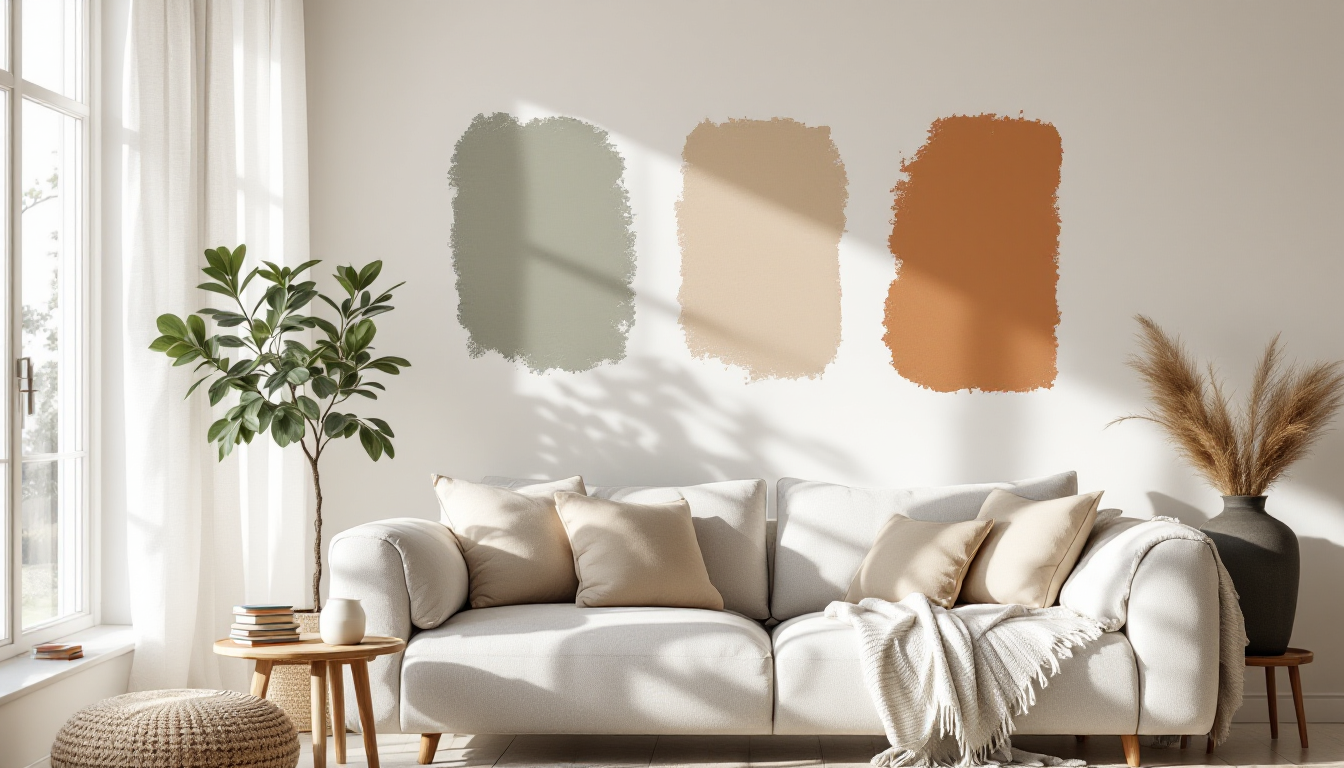
Why color feels so hard to get right
Most people don't struggle with color because they lack taste — they struggle because they're trying to pick a wall color before they've decided anything else. Paint is the last decision, not the first. Once you understand the order of operations, choosing a palette becomes a lot less stressful and a lot less likely to end in a return trip to the paint counter.
This guide walks through the basics step by step, so if you're decorating your first room on your own, you can follow along in order rather than guessing.
Step 1: Start with what you're keeping, not what you're buying
Before you open a single paint fan deck, take stock of the large, hard-to-change elements already in the room: flooring, countertops, a sofa you're not replacing, tile in an adjoining bathroom. These items have fixed undertones, and your palette needs to work with them, not against them. A warm oak floor will clash with an icy blue-gray wall in a way that's subtle but persistently "off."
If you're still in the early planning stage and haven't finalized the room's layout or furniture yet, it's worth measuring the room properly first. Accurate dimensions help you visualize how much wall, floor, and natural light you're actually working with, which directly affects how a color will read once it's up.
Step 2: Identify undertones before you pick anything
Every color — including "neutral" whites, grays, and beiges — has an undertone: warm (yellow, pink, orange) or cool (blue, green, violet). Undertones are the single biggest reason palettes go wrong. A gray with a purple undertone next to a beige sofa with a yellow undertone will look muddy, even though both seem neutral in isolation.
- Check undertones in natural daylight, not under warm bulbs, which flatter almost everything.
- Hold swatches against your fixed elements — flooring, trim, stone — not against a white wall.
- Squint at the swatch: undertones often become more obvious when you blur your focus slightly.
Step 3: Use the 60-30-10 rule as your structure
This classic ratio is the easiest way for a beginner to avoid a palette that feels either flat or chaotic:
- 60% dominant color — usually your walls, and sometimes large upholstery. This sets the overall mood.
- 30% secondary color — curtains, an accent chair, a rug. This adds contrast without competing.
- 10% accent color — pillows, art, vases, a single bold object. This is where you can be a little braver.
Once you have this structure, the question shifts from "what color should this room be?" to "what goes in each of these three slots?" — which is a much easier problem to solve.
Step 4: Choose a mood before a hue
Rather than starting with "I want blue," start with how you want the room to feel: calm, energizing, cozy, airy. Then let that mood guide hue, saturation, and value.
- Calm, Scandinavian-style rooms lean on muted, low-saturation neutrals with one soft accent — think oat, stone, and sage.
- Warm, mid-century-inspired rooms use richer, earthier tones — terracotta, mustard, walnut brown — paired with warm wood.
- Energizing spaces like a home office or kitchen can handle more saturated accents, as long as the dominant 60% stays grounded.
Saturation and brightness matter more than the specific hue. Two rooms can both be "blue" and feel completely different depending on how muted or vivid that blue is.
Step 5: Test swatches properly before committing
Paint chips lie — not maliciously, but reliably. The only way to know how a color behaves is to test it on the actual wall, at actual size, at different times of day.
- Paint sample squares at least 12x12 inches, on two or three different walls (light tends to hit each wall differently).
- Look at them in the morning, midday, and evening, including under your actual light bulbs at night.
- Live with the samples for a few days before deciding — colors can look drastically different after 48 hours of adjusting your eye to them.
If you'd rather not commit to physical paint samples at all, digital tools can help you preview a palette on walls and furniture before buying anything. Visualization features inside a home design planner let you test wall colors against your actual room layout, which is especially useful if you're also deciding on furniture placement at the same time.
Step 6: Build confidence with material and lighting context
Color never exists in isolation — it's always read in relation to materials and light. The same palette can look polished or flat depending on finishes like matte vs. glossy paint, natural wood tones, or metal fixtures. If you're also exploring how materials render and look under different lighting, it's worth understanding the basics covered in this guide to realistic material surfaces, which explains how texture and reflectivity change the way a color is perceived, a concept that applies to real rooms just as much as 3D renders.
And if color is just one piece of a bigger decorating learning curve, it's worth looking at the wider landscape of beginner interior design resources, from apps to courses, to figure out which approach fits how you like to learn.
A simple checklist to finish with
- Identify fixed elements and their undertones first.
- Decide on a mood, then translate it into hue and saturation.
- Apply the 60-30-10 rule to structure your choices.
- Test large swatches in real light before buying full cans.
- Consider materials and finishes, not just paint color, as part of the overall palette.
Choosing a color palette doesn't require a design degree — it requires a sequence. Follow the steps in order, and the "right" colors tend to reveal themselves rather than needing to be guessed.