What Are PBR Materials? A Beginner's Guide to Realistic 3D Surfaces
By Conor Sheridan, 3D Visualization Lead · October 1, 2026
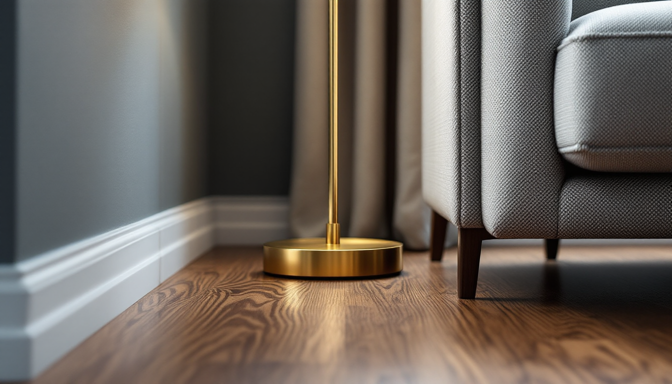
If you've ever looked at a 3D render of a living room and genuinely couldn't tell it wasn't a photograph, there's a good chance PBR materials were doing a lot of the work. PBR stands for Physically Based Rendering, and it's the standard approach modern software uses to make surfaces — wood, fabric, metal, glass, skin, stone — react to light the way they actually do in real life. This guide breaks down what PBR materials are, how they're built, and how to start using them even if you've never opened a 3D program before.
The Problem PBR Solves
Before PBR became the norm, a lot of 3D materials were essentially a flat color photo stretched over a shape, with lighting faked on top. It looked fine from one angle, under one light, but the moment you moved the camera or changed the lighting, the illusion broke. Shiny things didn't reflect correctly. Matte things looked plastic. Nothing behaved consistently.
PBR fixes this by modeling the actual physics of how light interacts with a surface — how much it reflects, how much it scatters, how rough or smooth it is at a microscopic level. Because the material responds to light based on real rules, it looks correct under any lighting condition, from a dim evening interior to bright midday sun. This is a big part of why modern interior renders and believable lighting setups go hand in hand — good lighting only pays off when the materials underneath can respond to it realistically.
The Core Maps That Make Up a PBR Material
A single PBR material isn't just one image — it's usually a stack of several grayscale or color "maps," each controlling a different physical property. As a beginner, these are the ones worth knowing first:
- Base Color (Albedo): The raw color of the surface, without any lighting or shadow baked in. Think of it as the material's "true" paint color.
- Roughness: Controls how sharp or blurry reflections are. A polished countertop has low roughness (tight, mirror-like highlights); a raw concrete floor has high roughness (soft, diffuse highlights).
- Metalness: A simple switch, roughly speaking, between "metal" and "non-metal" behavior, since metals reflect light very differently than wood, fabric, or plastic.
- Normal Map: Fakes small bumps and dents — like wood grain or fabric weave — by bending how light appears to hit the surface, without adding real geometry.
- Height/Displacement Map: Similar to a normal map but can actually push and pull the surface, useful for deeper textures like brick or tile grout lines.
- Ambient Occlusion (AO): Adds subtle shadowing in tight crevices and corners where light naturally has a harder time reaching.
Together, these maps let a renderer calculate, pixel by pixel, exactly how light should bounce off that surface — which is why a PBR wood material looks convincing whether it's lit by a window, a lamp, or an outdoor HDRI sky.
How to "Read" a PBR Material as a Beginner
When you're starting out, you don't need to understand the math behind it. You just need to get comfortable looking at a material and asking three questions:
- Is it metal or not? This decides whether the reflections will be colored (like gold or copper) or neutral (like most non-metals).
- How rough is it? Glossy and smooth, or matte and soft? This alone changes the mood of a render dramatically.
- Does it have visible texture? Wood grain, fabric weave, or stone pitting usually comes from the normal and height maps, not the base color.
Practicing this on everyday objects — a ceramic mug, a leather chair, a brushed-steel appliance — trains your eye quickly. It's a similar instinct to learning how to compare different wood species for furniture: once you know what to look for, the differences jump out immediately.
Where PBR Materials Actually Get Used
PBR isn't just a rendering buzzword — it's the backbone of several practical workflows in home and interior design:
- Interior renders: Designers apply PBR materials to walls, floors, and furniture to preview a room before anything is built or purchased.
- Real-time walkthroughs: Game-engine-based tools (Unreal, Unity, and similar) rely entirely on PBR so a client can walk through a space interactively, from any angle, in real time.
- Product visualization: Furniture and material brands use PBR to show accurate swatches online, so what you see on-screen is close to what arrives at your door.
- GLB and glTF exports: When a 3D model needs to move between programs — or get embedded in a web viewer — PBR properties travel with it in a standardized way, keeping the look consistent across platforms.
This consistency matters most when a project moves from concept to delivery. A clean 3D floor plan or interior model built with proper PBR materials will look right whether it's rendered as a still image, dropped into a real-time walkthrough, or exported as a lightweight file for a client to view on their own device.
Getting Started: A Simple First Workflow
If you want to experiment with PBR materials yourself, here's a beginner-friendly path:
- Start with free, pre-made PBR material libraries (many 3D programs include some) rather than building maps from scratch.
- Apply a material to a simple object — a cube or a sphere — and rotate the lighting around it to see how roughness and metalness change its appearance.
- Swap in a normal map and compare the same object with and without it, so you can see exactly what that map is contributing.
- Once comfortable, try matching a PBR material to a real sample, like a tile or fabric swatch, to train your eye for realistic roughness and color values.
Understanding PBR materials is one of the more transferable skills in design and visualization — it connects directly to lighting, texturing, and how a space is ultimately rendered or walked through. It pairs naturally with other foundational topics, like basic interior design principles, since realistic materials only matter once the room layout and composition are solid. Once the fundamentals click, everything from a quick render preview to a full real-time walkthrough starts to look dramatically more convincing.