Normal Map vs Bump Map: 6 Texturing Approaches Compared for Home Design Visualization
By Ingrid Halvorsen, Home Planning Specialist · August 7, 2026
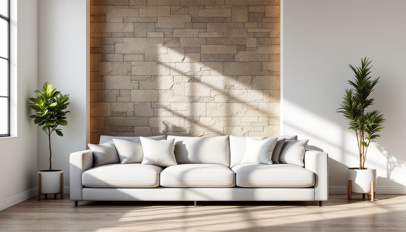
Choosing the right way to fake surface detail
When you're building a 3D visualization of a home — whether it's a rendered kitchen elevation or a full walkthrough of a floor plan — the texture on your walls, cabinetry, and flooring does a lot of the emotional work. Flat color reads as cheap; convincing surface detail reads as real. The question is which technique gets you there without blowing your render budget or your patience. This guide lines up the most common options side by side so you can pick the right tool for the job, whether you're producing a quick concept board or a client-ready render tied to a 3D home plan.
If you want the fundamentals first — what these maps actually are and how they trick the eye — our companion piece, Normal Map vs Bump Map: A Beginner's Guide to Faking Surface Detail, covers that ground. This article assumes you know the basics and focuses on comparing your practical options.
The six approaches compared
1. Bump maps
Bump maps use a grayscale image to nudge the surface normal at render time, faking bumps and grooves without changing geometry. They're the lightest-weight option in terms of file size and computation, which makes them a reasonable choice for background elements — a distant brick wall, a rarely-seen closet interior, or props that will never fill the frame.
- Best for: low-priority surfaces, quick mockups, older or low-power hardware
- Weak spot: detail looks flat and directionless under strong side lighting, and edges can look mushy
2. Normal maps (tangent-space)
Normal maps store direction data in RGB channels, encoding which way each point on the surface should appear to face. This gives noticeably crisper detail — mortar lines, fabric weave, wood grain — and it reacts more believably to moving lights, which matters if you're producing a walkthrough animation rather than a single still.
- Best for: hero surfaces — kitchen countertops, feature walls, upholstery in a rendered living room
- Weak spot: slightly heavier to bake and store; silhouettes still stay flat since geometry is untouched
3. Object-space normal maps
A less common cousin of the tangent-space normal map, object-space maps encode direction relative to the whole object rather than each surface point. They're more forgiving on curved, continuous surfaces like a rolled-arm sofa or a curved staircase baluster, but they don't tile — every unique object needs its own bake, so they're impractical for repeating materials like tile or flooring.
- Best for: one-off curved furniture pieces in a hero render
- Weak spot: unusable for tileable, repeating materials
4. Displacement maps
Unlike bump and normal maps, displacement maps actually move the geometry, which means real shadows fall correctly along edges and the silhouette changes. For a raked-light shot of a stone accent wall or deeply grouted tile in a bathroom render, this is the only option in this list that will hold up to close inspection.
- Best for: extreme close-ups, hero materials with deep relief (stacked stone, heavy plaster texture)
- Weak spot: render time cost is the highest here; needs enough mesh subdivision to look right
5. Height maps used as parallax (POM)
Parallax occlusion mapping fakes depth using a height map and screen-space shifting, giving a look close to displacement without adding real geometry. It's popular in real-time engines used for interactive 3D home tours, since it's cheaper than true displacement but reads convincingly at most viewing angles.
- Best for: interactive walkthroughs and real-time viewers where performance matters
- Weak spot: can "swim" or break at grazing angles near silhouette edges
6. Photogrammetry-baked material sets
Rather than hand-painting or procedurally generating a bump or normal map, some studios scan real materials — reclaimed wood, tumbled marble — and bake the resulting normal, roughness, and displacement maps together as a matched set. This gives the most physically accurate result but requires either purchasing a material library or investing in a scanning workflow.
- Best for: photoreal marketing renders where material accuracy is non-negotiable
- Weak spot: cost and licensing; less flexible if you need a custom, non-real pattern
A quick decision checklist
- Is the surface far from camera or rarely seen? Use a bump map and save your budget.
- Is it a hero surface in a still render? Reach for a tangent-space normal map first.
- Will the camera get close, or is the light raking across deep grooves? Step up to displacement.
- Is this for a real-time, interactive walkthrough? Parallax or normal maps will perform better than true displacement.
- Do you need material-accurate realism for a client presentation? Consider a scanned/photogrammetry material set.
Most home visualization projects end up mixing several of these — bump maps on background elements, normal maps on most furniture and walls, and displacement reserved for the two or three surfaces that will actually get a close-up. That layered approach mirrors how good space planning works generally: not every decision needs the same level of detail. The same logic applies when you're deciding how much time to spend on a small bathroom floor plan layout versus a statement kitchen island — prioritize where the eye actually lands.
Where texture choice fits into the bigger picture
It's easy to get absorbed in texture maps and forget that they only matter once the underlying layout is right. A beautifully normal-mapped countertop won't save a kitchen render if the work triangle or zone layout feels awkward, and no amount of displacement detail fixes a floor plan with poor flow. Texturing is the final coat of paint on a design decision that should already be sound — get the plan right first, then let normal, bump, or displacement maps do what they're best at: convincing the eye that a rendered surface is one you could actually run your hand across.