How to Style a Bookshelf: A Beginner's Guide
By Adrian Kessler, Architecture & Structure Writer · August 4, 2026
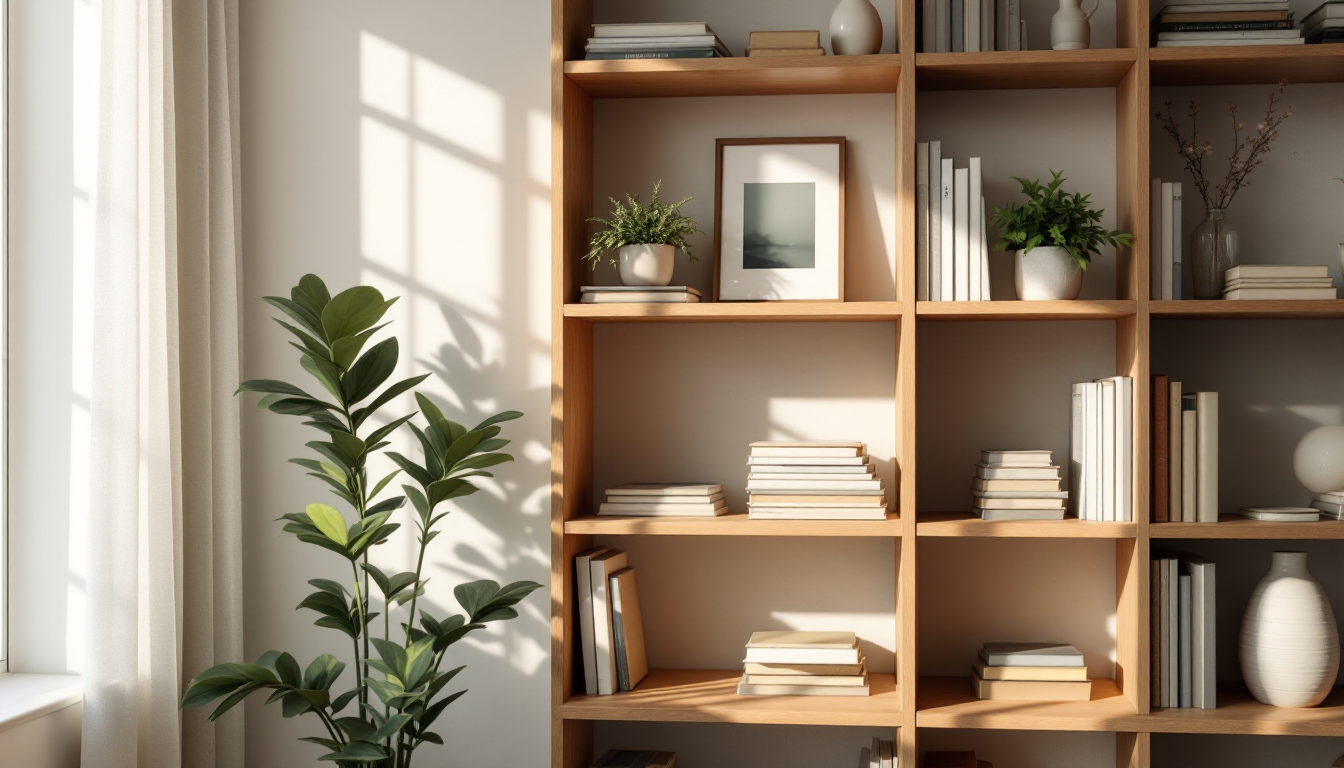
Why Bookshelf Styling Matters More Than You Think
A bookshelf is one of the few pieces of furniture that functions as both storage and portrait of its owner. Done well, it anchors a room, adds texture, and gives your eye somewhere pleasant to land. Done poorly, it becomes a jumbled catch-all that makes an entire wall feel cluttered. If you're new to styling, the good news is that the principles are simple and repeatable — you don't need a design degree, just a system.
This guide walks through the basics from the ground up: what to keep, how to group it, and how to arrange it so the shelf looks intentional rather than accidental. If your room needs more than a shelf refresh — say, a full mood shift toward warmth and comfort — you may also want to read our guide on how to make a room look cozy for complementary ideas that work alongside a styled shelf.
Step 1: Edit Before You Decorate
Before touching layout, pull everything off the shelf and sort it into three piles: books you actually want displayed, objects worth showcasing, and everything else. Not every book needs to be on view — paperbacks with worn spines or duplicate copies can live elsewhere. This editing step is the single most important part of the process, because a shelf with fewer, better items will always look more curated than one crammed with everything you own.
As you sort, group books loosely by size and color. You don't need a rigid system yet, just a general sense of what you have to work with.
Step 2: Establish a Rhythm of Vertical and Horizontal Stacks
The most common beginner mistake is lining every book up vertically, spine-out, like a library. It's functional but visually flat. Instead, alternate:
- Vertical rows for the bulk of your books, grouped by height so the tops form a loose line.
- Horizontal stacks of 3-6 books, which break up repetition and create a surface for small objects.
- Bookends to hold either style in place, chosen in a material that contrasts with the shelf itself, such as brass on wood or matte stone on painted shelving.
A useful rule of thumb: aim for horizontal stacks on roughly one-third of your shelf sections, leaving the rest vertical. This ratio reads as balanced without looking overly patterned.
Step 3: Add Objects in Threes
Once books are placed, layer in objects — a small plant, a framed photo, a bowl, a piece of pottery. Designers lean on odd numbers because they photograph and read better than even ones; a group of three objects at varying heights feels more natural than a symmetrical pair. Place one object on a horizontal book stack, one standing alone, and one tucked beside a vertical row.
Keep scale in mind. A tall, narrow object (a vase or a slim sculpture) works well standing on its own, while smaller items look better clustered so they don't get visually lost.
Step 4: Think in Terms of Color and Contrast, Not Just Objects
Color is where many first-time stylers get stuck. Two dependable approaches:
- Color blocking: Group books by spine color to create gradient sections — useful if you own a wide range of hues and want a bold, graphic look.
- Neutral base with accent pops: Keep most spines in white, cream, black, or wood tones, then let one or two colorful objects do the work of drawing the eye.
If your home leans toward a calmer, more pared-back palette, the neutral approach tends to age better and requires less rearranging over time. This is similar in spirit to the restraint used in Japandi and Scandinavian interiors, where a few well-chosen objects say more than a crowded surface.
Step 5: Leave Negative Space
Empty space is not wasted space — it's what keeps a shelf from feeling suffocating. A common guideline is to leave at least 20-30% of any given shelf section visually open, whether that means a gap beside a stack of books or empty wall showing through an open-back shelf. Negative space also gives your eye a place to rest between denser groupings, which is especially important on tall or multi-tier shelving units.
Step 6: Repeat Materials for Cohesion
Even a shelf with varied objects can look unified if two or three materials repeat throughout — say, brass, ceramic, and wood. Pick your materials before you shop for new decor pieces, and resist the urge to add something just because it's pretty in isolation. Cohesion comes from restraint, not accumulation.
Step 7: Step Back and Adjust
Once the shelf is styled, walk to the far side of the room and look at it as a whole, not section by section. Does one shelf look heavier than the others? Is there a cluster of similar colors bunched together instead of spread out? Small adjustments — moving one object diagonally across shelves, swapping a stack's orientation — often make the biggest visual difference.
If you're planning new shelving as part of a larger renovation or built-in layout, it helps to visualize the wall and surrounding room dimensions first. Tools like the room planning features on Home3DPlan let you test shelf placement and proportions digitally before committing to a design, which is especially useful if you're building custom units rather than working with something off the shelf.
Common Beginner Mistakes to Avoid
- Filling every inch — leaving no breathing room makes a shelf feel cluttered no matter how nice the objects are.
- Using only one orientation (all vertical or all horizontal) for every row.
- Ignoring scale, so a shelf ends up with all small or all oversized items and no variation.
- Overusing trendy decor that doesn't reflect what you actually read or collect — a styled shelf should still feel like yours.
Styling a bookshelf is ultimately a matter of practice: sort, group, contrast, leave space, and reassess. Once you've done it once, the process becomes intuitive, and future refreshes take minutes rather than hours.